Danbooru
Login Posts Comments Notes Artists Tags Pools Wiki Forum More »
Listing Upload Hot Changes Help

Search

  • Help
guro
scat
furry -rating:g

Artist

  • ? weno 490

Copyright

  • ? original 1.3M

General

  • ? 1girl 6.8M
  • ? black hair 1.7M
  • ? blush 3.3M
  • ? bra 226k
  • ? breasts 3.9M
  • ? flat chest 196k
  • ? grey background 307k
  • ? how to 1.4k
  • ? kneeling 131k
  • ? looking at viewer 3.8M
  • ? medium hair 460k
  • ? navel 1.3M
  • ? no shoes 104k
  • ? panties 704k
  • ? sitting 1.1M
  • ? small breasts 561k
  • ? smile 3.3M
  • ? thighhighs 1.3M
  • ? underwear 867k
  • ? underwear only 70k
  • ? wariza 92k
  • ? white bra 37k
  • ? white panties 205k
  • ? white thighhighs 276k

Meta

  • ? commentary request 3.6M
  • ? highres 6.2M
  • ? ↳ absurdres 2.2M
  • ? translated 588k

Information

  • ID: 425088
  • Uploader: スラッシュ »
  • Date: over 16 years ago
  • Size: 861 KB .jpg (2000x3000) »
  • Source: pixiv.net/artworks/3536279 »
  • Rating: Sensitive
  • Score: 26
  • Favorites: 109
  • Status: Active

Options

  • Resize to window
  • View smaller
  • View original
  • Find similar
  • Download

History

  • Tags
  • Pools
  • Notes
  • Moderation
  • Commentary
Resized to 42% of original (view original)
original drawn by weno

Artist's commentary

  • Original
  • はじめてのメイキング

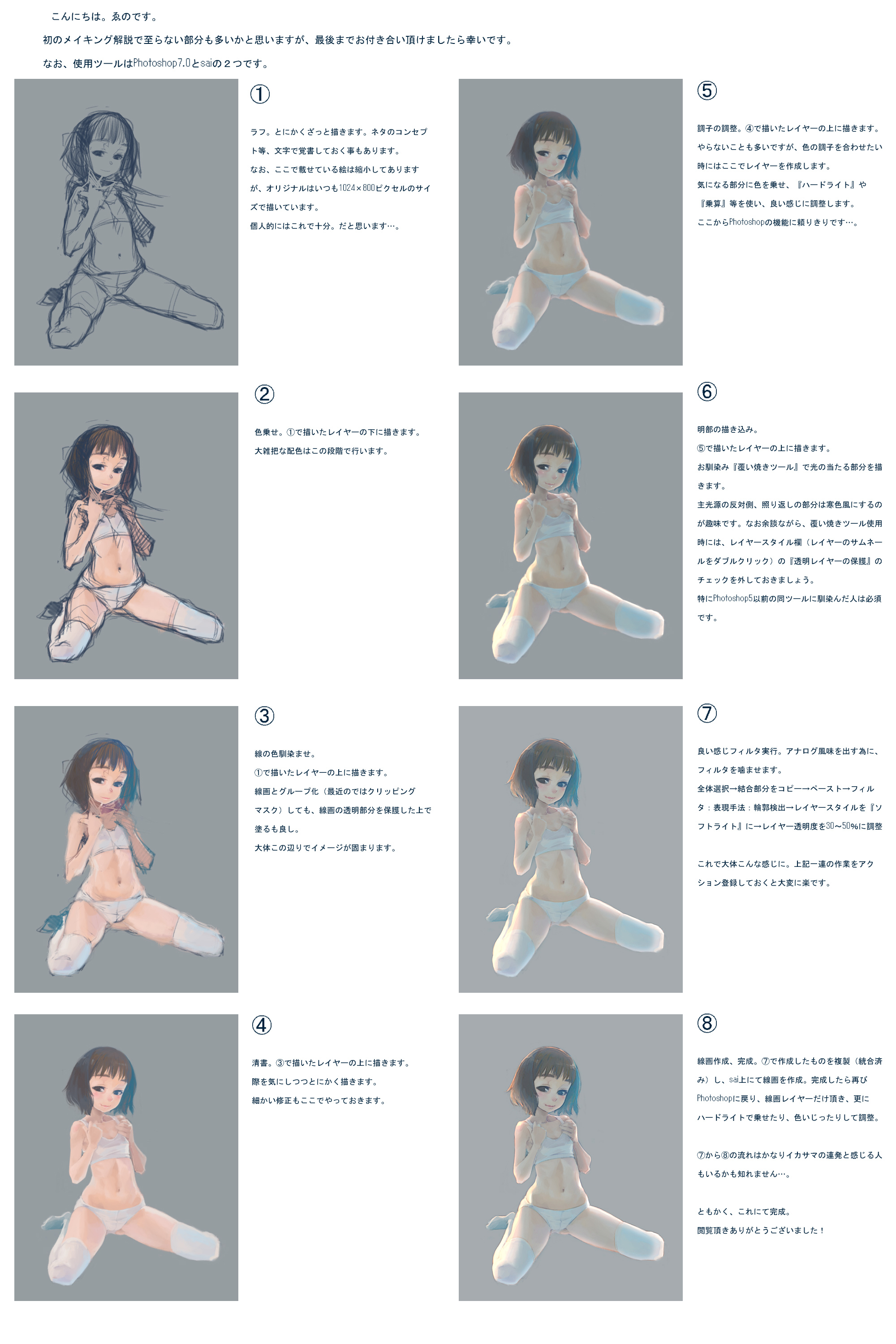
    ここで描かせて頂いた絵が100枚に達したと言う事で、普段やらない事をやってみました。中に書かれている事は普段やっていることですが。追記かつ訂正:⑥の『透明レイヤーの保護』×→『透明シェイプレイヤー』○です。結構重要な部分を間違えていました…。

    • ‹ prev Search: date:2009-03-21 next ›
    • « ‹ prev Pool: Learning How to Draw next › »
  • Comments
  • Recommended
  • Loading...

    user 9851
    over 16 years ago
    [hidden]

    Someone translate please.

    0 Reply
    • Copy ID
    • Copy Link
    user 104512
    over 16 years ago
    [hidden]

    i second this. it'd be pretty urgently needed :o

    0 Reply
    • Copy ID
    • Copy Link
    user 9851
    over 16 years ago
    [hidden]

    Art superiority complex much?

    -2 Reply
    • Copy ID
    • Copy Link
    chriselric
    over 16 years ago
    [hidden]

    I'm pretty sure that's not what he's actually writing but I never bothered to read it because my kanji library is rather limited

    Although I can't dismiss the possibility..

    0 Reply
    • Copy ID
    • Copy Link
    user 104512
    over 16 years ago
    [hidden]

    i got the real translation by a friend.
    this one is a total fail, also its just done 50%
    Its even worse because shii added senseless comments that dont have anything to do with whats actually written there.
    thanks!

    2 Reply
    • Copy ID
    • Copy Link
    Aline
    over 16 years ago
    [hidden]

    "magically create a perfect-looking sketch"

    You lost me.

    3 Reply
    • Copy ID
    • Copy Link
    nanasisan
    over 16 years ago
    [hidden]

    Better and complete translation. I'm sorry if I got some of the Photoshop terminology wrong, I'm not an artist...

    Also I still can't figure out why the "Dodge tool" has such a funny name.

    2 Reply
    • Copy ID
    • Copy Link
    user 104512
    over 16 years ago
    [hidden]

    thanks a lot nanasisan.
    thats much more detailed.

    1 Reply
    • Copy ID
    • Copy Link
    Quess
    over 16 years ago
    [hidden]

    I never thought of doing step #3. Nice idea.

    0 Reply
    • Copy ID
    • Copy Link
    lol wut
    over 16 years ago
    [hidden]

    I dont understand "color blending the lines" step.

    Doesnt he just erase the lines?

    0 Reply
    • Copy ID
    • Copy Link
    chriselric
    over 16 years ago
    [hidden]

    lol_wut said:
    I dont understand "color blending the lines" step.

    Doesnt he just erase the lines?

    I think he starts to blend the color og his lineart to the colors it borders, I.E, the lines aroudn the skin of her leg start to become more like the color of her leg. You see it often in certain style, I believe the art from the artist that did Odin Sphere does that.

    Gives everything a sort of hand painted canvas quality to it.

    0 Reply
    • Copy ID
    • Copy Link
    lol wut
    about 16 years ago
    [hidden]

    Thanks for the clarification, I tried doing that but it ends up smudgy and low contrast, guess I have to keep trying

    0 Reply
    • Copy ID
    • Copy Link
    Pepsi
    over 15 years ago
    [hidden]

    If only coloring that well was as easy as doing as said. But the biggest problem is choosing the right shades, light sources and stuff like that :(

    0 Reply
    • Copy ID
    • Copy Link
    Coloring. Draw under the layer I drew in step 1. This is the step where the the general color scheme is set.
    Using a filter to give it a good feeling. In order to make it look more analog-like, use a filter. Select all → copy merged → paste → Filter: Expression/technique: Edge detection → change layer style to "soft light" → adjust layer transparency to 30-50% After that the picture looks pretty much like this. If you save the above procedure as a macro it'll become much easier.
    Create the line drawing, complete. Take a copy of what was created in step 7 (combined) and draw the lines in sai. When you're done, return to Photoshop, take only the line art layer, and adjust by adding hard light or tweaking the colors. I guess some people might think that the part from step 7 to 8 is just a bunch of trickery... At any rate, this completes the picture. Thank you very much for reading!
    Hi. My name is Weno. This is my first "making of" tutorial, so I think there's a lot of room for improvement, but I would be very happy if you could read it to the end. The tools I used were Photoshop 7.0 and sai.
    Rough sketch. Just draw some sort of sketch. Sometimes I write the concept and so on down as a memo. The pictures shown here have been shrunk, but I always draw the originals using 1024x800 pixels. Personally, this is enough. I think...
    Color blending the lines. Draw above the layer from step 1. You may either group it with the lines (or in the recent versions, use a clipping mask) or color while preserving the transparent parts of the lines. At this stage, the image takes more or less its final form.
    Adjusting the style. Draw above the layer from step 4. I don't do this very often, but when I want to adjust the colors I create a new layer here. I add light to parts that bother me, use "Hard light" and "Multiplication" and so in, and adjust the colors so that they look good. After this I rely on Photoshop's features a lot...
    Drawing the lighter parts. Draw above the layer from step 5. Draw the parts where the light hits using the familiar "Dodge tool". My personal preference is to use cool colors for the opposite side of the main light source, where the reflected light hits. By the way, when using the Dodge tool, don't forget to uncheck "Protect transparent layers" from the layer style dialog (double click the layer thumbnail). This is especially important for people who are used to the tool from Photoshop 5 or earlier.
    Cleaning. Drawing above the layer from step 3. Just draw while minding the edges. Also take care of any small corrections in this step.
    Terms / Privacy / Upgrade / Contact /